Photo comparison shows the comparison between two photos so that users can easily understand the difference between them. So if you are looking for a way to display the photo comparison in Gutenberg, this article can give you a complete guideline on creating a photo comparison in Gutenberg.
As a result, you can create your expected photo comparison in Gutenberg without having any coding knowledge. Let’s drive in deep to showcase any amazing photo comparison.
GutSlider: Simplifies the Photo Comparison
By default, Gutenberg doesn’t have any built-in blocks that help you to create a photo comparison easily. That’s why we have searched for better solution and finally we built GutSlider that comes with a complete solution for photo comparison.
GutSlider is a powerful tool that has a Before and After block that allows you to visually compare multiple images side-by-side in a visually appealing and engaging way. Here are the key features that will amaze you enough to choose the GutSlider.
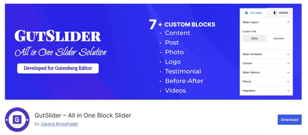
Key Features
- The block offers a simple and intuitive interface, making it easy to add and compare images without requiring any coding knowledge.
- You can customize the appearance of the comparison, including the size of the images, the spacing between them, and the overall layout.
- The comparison will automatically adjust to different screen sizes, ensuring a great user experience on all devices.
- You can compare up to four images at a time.
- Add captions to each image to provide additional context or information.
- The visual comparison format can help to increase user engagement and make your content more interesting.
Installation and Activation
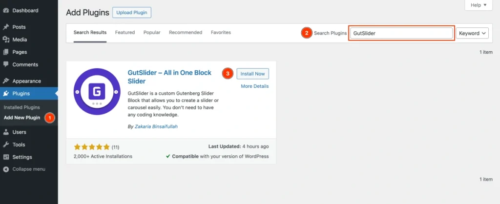
GutSlider is easy to install and activate, and the procedure is similar to that of other WordPress plugins. If installing and activating WordPress plugins is new to you, take these steps:
- Login to Your WordPress Dashboard: Start by logging into the admin area of your WordPress website using your credentials.
- Navigate to the Plugins Menu: In the left sidebar of the dashboard, find and click on “Plugins.” You can also hover over it to reveal the “Add New Plugin” option.
- Add New Plugin: After opening the “Plugins” page, click the “Add New Plugin” button at the top of the page.
- Search for GutSlider: In the search bar located at the top right corner, type “GutSlider.”.
- Install the Plugin: When you see the GutSlider plugin in the search results, click the “Install Now” button next to it. The installation process will begin.
- Activate the Plugin: Once the installation completes, the “Install Now” button will change to an “Activate” button. Click on “Activate” to enable the plugin on your site.
Add Before After Block in Editor
GutSlider’s Before After block must be used in order to create a Before After block in Gutenberg. First, we need to insert the Before After block in the Gutenberg editor.
There are two methods by which you can add the block:
With Shortcut
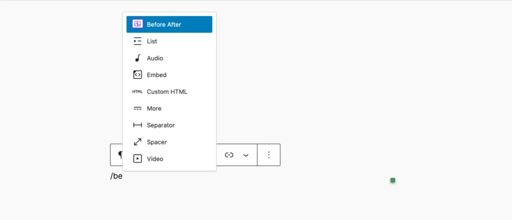
Type Before After and the forward slash (/) in the paragraph block that appears in the placeholder. The Before After block will be suggested; just click the block, and it will be immediately inserted.
From Blocks Inserter
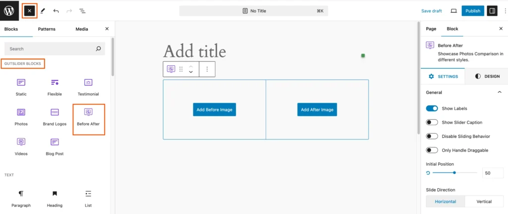
Click on the Blocks Inserter plus (+) icon. Consequently, the block panel will open. Now you can either search for Before After or go to the GutSlider Blocks category, and you will find the Before After block. You can either drag and drop the block in the editor or just click on it. When you do this, the block will be immediately added to the editor.
Add Before-After Photos
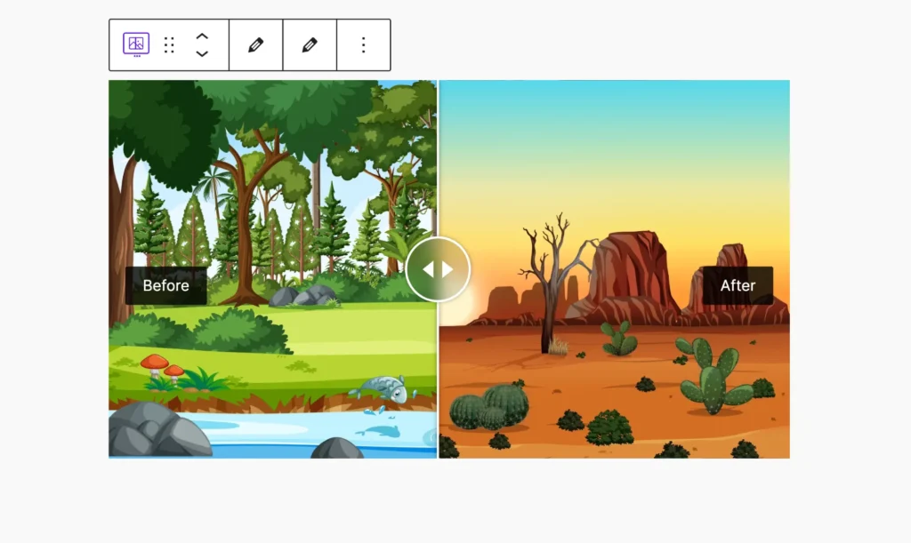
The Before After block includes two photo upload buttons, one for the before image and another for the after image. So, use these two buttons to upload photos from your media library or directly upload from your computer.
Once you add these two images, you will see the photo comparison immediately. It looks like the below screenshot:
Edit Before-After Photos
The “Before After” block can have images added or removed by selecting the Edit icon in the toolbar. There are two edit icons; one is for the Before image and another is for the After image.
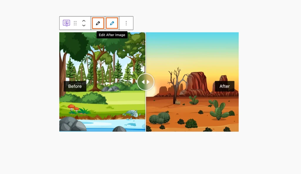
So, to edit any image, simply click on that edit icon; consequently, it will open the media library
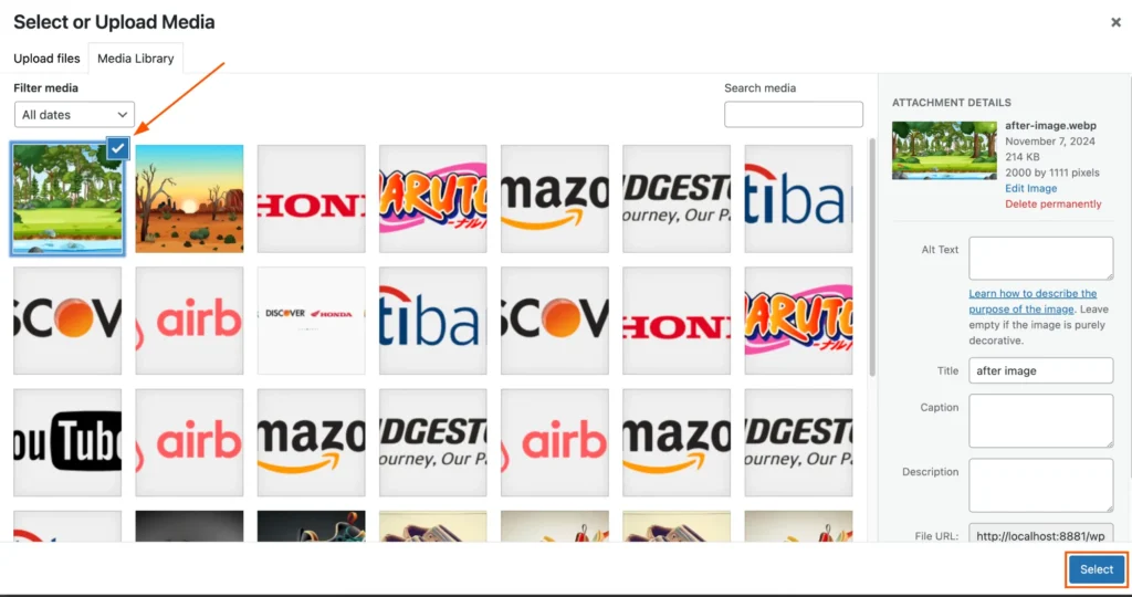
For example, if I click on the before image edit icon, it will open the following screen. Now navigate and select which image you want to use, and then click on the “Select” button.
Slide Direction
The Before-After block includes two types of slide directions, and they are:
- Horizontal: It is the default slide direction. It allows users to move the slide from left or right or right to left horizontally.
- Vertical: The vertical slide direction allows you to slide it from top to bottom or bottom to top vertically.
Swipe Mode
Both drag and hover swipe modes are available for the Before After block. Both drag and hover swiping modes are available to you. Drag mode, which lets you slide the handle while dragging, is the default mode.
Customization
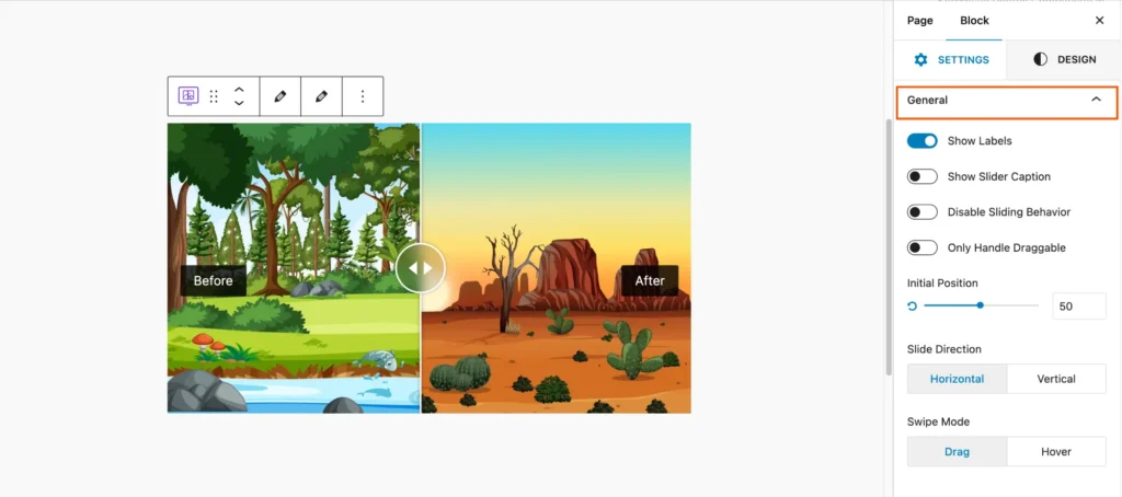
The configuration panel is titled General, indicating it’s for adjusting basic settings for the slider.
- Show Labels: A toggle switch that, when enabled, displays labels on the slider. Labels could indicate “Before” and “After” for clarity.
- Show Slider Caption: This toggle controls whether captions are displayed along with the slider. When turned on, text captions related to the images will be visible.
- Disable Sliding Behavior: This option disables the sliding functionality. When enabled, users may not be able to interact with the slider to move between images.
- Only Handle Draggable: When enabled, this restricts the sliding to only occur when dragging the handle. Users cannot swipe or click elsewhere to interact with the slider.
- Initial Position: A slider control (with a percentage value) allows you to set the default position of the slider handle. The number (in this case, 50) indicates the initial placement of the handle, likely in the middle by default.
Slide Labels
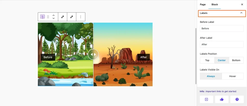
- Labels Section: The section is titled Labels, indicating that the following options pertain to customizing the labels for the slider (likely the “Before” and “After” text shown on the slider).
- Before Label: A text field where you can input the label for the Before image. By default, the text is set to “Before.” You can modify this text to suit your preference, such as “Original” or another description.
- After Label: A text field to set the label for the After image. The default is “After,” but you can change this text to something else, like “Updated” or another relevant description.
- Labels Position: This option allows you to choose the position of the labels on the slider:
- Top: The labels will appear at the top of the slider.
- Center: The labels will be displayed in the center of the slider.
- Bottom: The labels will be placed at the bottom of the slider.
- Labels Visible On: This option defines when the labels will be visible:
- Always: The labels are always visible on the slider.
- Hover: The labels only appear when the user hovers over the slider with their mouse.
Style
GutSlider comes with complete customization options. You can style every element that you want.
Container
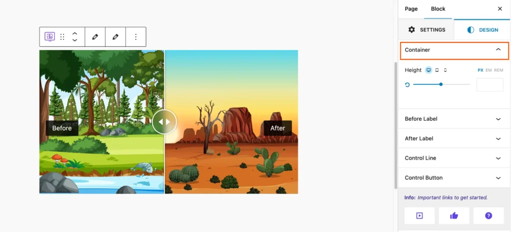
In the Container settings of the Before After block, you have options to control the overall layout and dimensions of the block. You can adjust:
- Height: Set the height of the container to control the size of the images displayed in the slider. You can specify the height in different units, such as pixels (px), em, or REM, to best fit your layout.
Before and After Labels Style
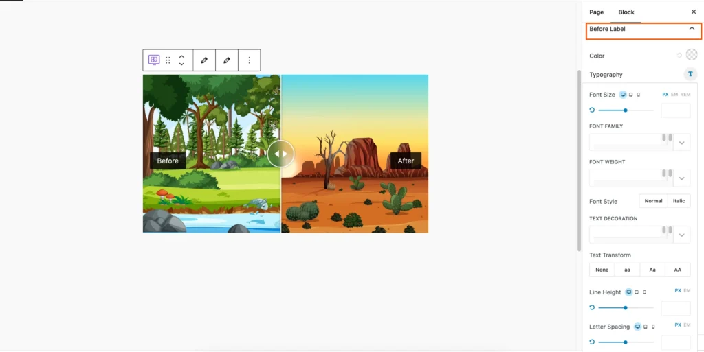
Style choices allow you to change the look of elements. For example, you may use Before Label to put text before the main label, border, border radius, margin, padding, and typography.
Additional choices include Background Color for customizing the background and Box Shadow for shadow effects.
Control Line
There is a complete list of customization options for the control line, as a result, you can create your own customizable control line for the photo comparison slider.
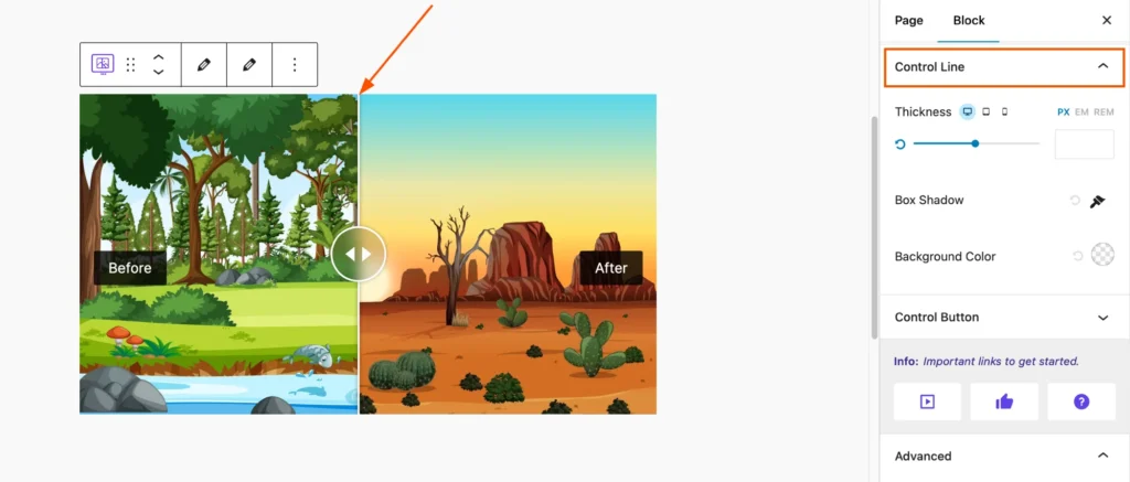
- Thickness: This option allows you to adjust the thickness or width of the line, with options for specifying the thickness in pixels (PX), ems (EM), or rems (REM). There is also a slider for adjusting the thickness visually.
- Box Shadow: This setting allows you to add a shadow effect to the line, with options for color, opacity, blur radius, spread radius, and horizontal and vertical offset.
- Background Color: This option lets you select the background color for the line.
Control Button
You can also add custom style for the control button. You will find all of the necessary customization options to add any style for the control button.
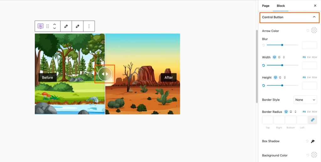
- Arrow Color: This option allows you to select the color for any arrows or icons associated with the button.
- Blur: This setting controls the blur or shadow effect applied to the button.
- Width: This option lets you adjust the width of the button, with options for specifying the width in pixels (PX), ems (EM), or REM.
- Height: This option allows you to adjust the height of the button, with options for specifying the height in pixels (PX), ems (EM), or REM.
- Border Style: This option lets you choose the type of border for the button, such as solid, dashed, dotted, or none.
- Border Radius: This setting controls the rounded corners of the button, with options for specifying different radii for top, right, bottom, and left corners.
- Box Shadow: This setting allows you to add a shadow effect to the button, with options for color, opacity, blur radius, spread radius, and horizontal and vertical offset.
- Background Color: This option lets you select the background color for the button.
Conclusion
The Before and After block from Gutenberg is a helpful resource for creating aesthetically pleasing and instructive information. It is an adaptable choice for a variety of applications due to its responsive design, customization options, and user-friendliness. You may improve the storytelling and engagement of your website by making good use of this block.