The block editor in Gutenberg provides an easy-to-use, versatile platform for writing blog entries. It is simple to organize blog content for an interesting, readable experience with the help of different blocks for text, images, multimedia, and layout customization. While reusable blocks enable consistent styling, visual appeal can be added with blocks like headings, images, quotes, and galleries. The process of creating blog posts is made dynamic and efficient with Gutenberg, and it can be customized to fit any blogging style.
GutSlider: Super Blog Post Slider
GutSlider is a robust Gutenberg block plugin that offers a range of carousels and sliders, including a versatile block that enables you to slide any kind of content inside Gutenberg. Additionally, you can customize each slider or carousel to meet your unique needs thanks to its extensive customization options.
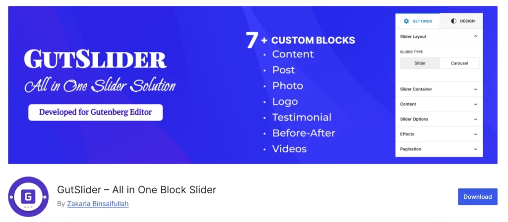
Key Features
- Optimize your site’s performance by loading scripts and styles only when the slider is active, reducing unnecessary resource usage.
- Beyond images, embed text, videos, and even dynamic content like forms or buttons within each slide for a truly interactive experience.
- Customize your slider’s layout, navigation, and pagination with a user-friendly interface that requires no coding knowledge.
- Designed exclusively for Gutenberg, ensuring seamless integration and compatibility with other blocks.
- Enjoy fast page load times, even with multiple sliders in use, thanks to GutSlider’s focus on minimal resource usage.
- Rearrange and customize slides easily using the drag-and-drop interface.
- Sliders automatically adjust to various screen sizes, delivering a consistent experience on desktop, tablet, and mobile.
- Powered by Swiper JS, offering fast, touch-responsive sliders without relying on bulky jQuery libraries.
- Modify transitions, set custom delay intervals, and select from a range of animations to suit your design needs.
Installation and Activation
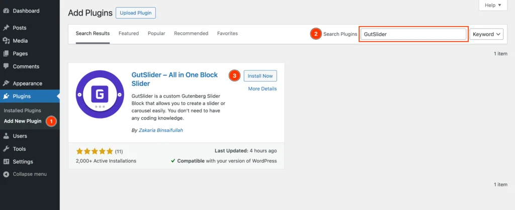
- Login to Your WordPress Dashboard: Start by logging into the admin area of your WordPress website using your credentials.
- Navigate to the Plugins Menu: In the left sidebar of the dashboard, find and click on “Plugins.” You can also hover over it to reveal the “Add New Plugin” option.
- Add New Plugin: After opening the “Plugins” page, click the “Add New Plugin” button at the top of the page.
- Search for GutSlider: In the search bar located at the top right corner, type “GutSlider.”
- Install the Plugin: When you see the GutSlider plugin in the search results, click the “Install Now” button next to it. The installation process will begin.
- Activate the Plugin: Once the installation completes, the “Install Now” button will change to an “Activate” button. Click on “Activate” to enable the plugin on your site.
Add Block Post in Editor
To create a Blog Post in Gutenberg, we have to use the GutSlider’s Blog Post. Begin by inserting the Blog Post directly in the Gutenberg editor.
There are two ways to add this block; you can follow any step that is flexible for you.
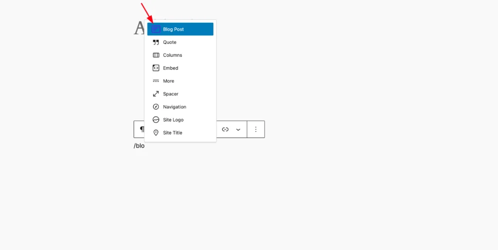
Add With Shortcut
In the placeholder paragraph block, type “Blog Post.” The Blog Post will show up in the list of suggestions; click it to insert it straight into the editor.
From Block Inserter
Click on the Blocks Inserter plus (+) icon. As a result, it will open the blocks panel. Now you can either search for Blog Post or go to the GutSlider Blocks category, and you will find the Blog Post. Simply click on the block or drag and drop the block in the editor. Once you do this, the block will be inserted in the editor instantly.
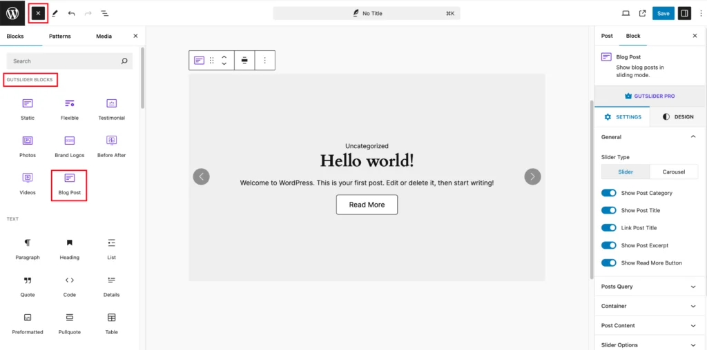
A default Blog Post will be created immediately after you upload your Blog Post. The following Blog Post will appear if all of these steps are correctly followed:
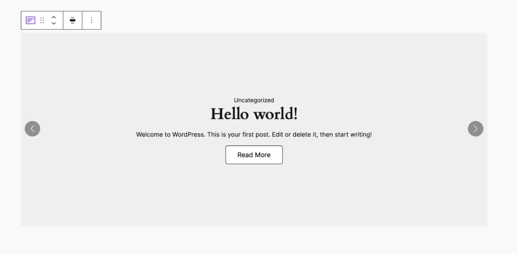
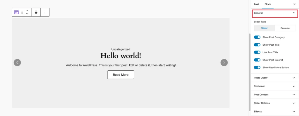
General Settings
A Gutenberg blog post on General Settings examines important WordPress editor customization choices, including changing discussion settings, featured images, permalinks, and titles.
- Slider: Shows one item at a time, sliding to the next.
- Carousel: Displays multiple items in a row, scrollable.
- Show Post Category: Toggle to display or hide post categories.
- Show Post Title: Enable/disable the post title display.
- Link Post Title: Makes the post title clickable.
- Show Post Excerpt: Displays a short summary of each post.
- Show Read More Button: Adds a button to view the full post.
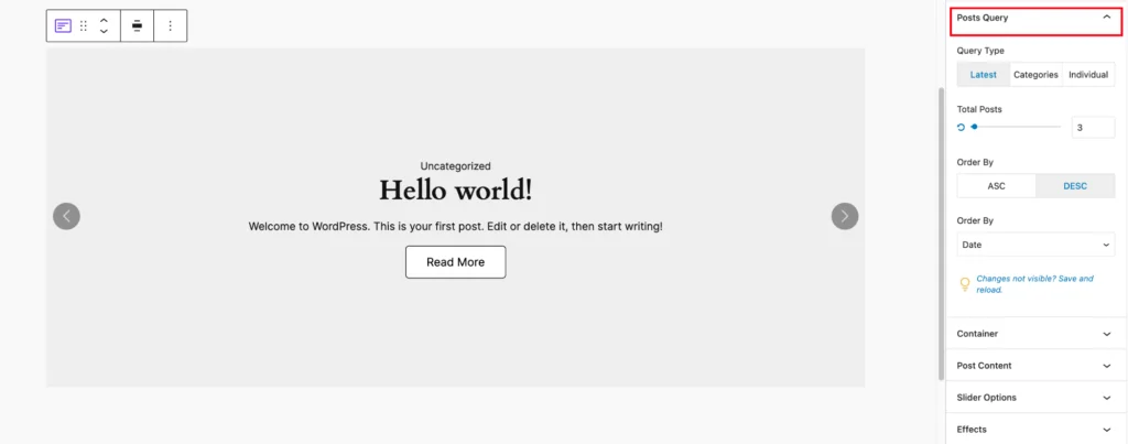
Post Query
A Post Query blog post explains how to use WordPress’s post query feature to display specific posts based on set criteria, such as categories, tags, authors, or dates.
- Query Type: Allows you to select the source of posts to be displayed in the slider or carousel. You can choose from:
- Latest: Displays the most recent posts.
- Categories: Displays posts from specific categories.
- Individual: Lets you manually select specific posts to show.
- Total Posts: Adjust the number of posts to be displayed in the slider or carousel using the slider bar. In this case, the value is set to show 3 posts.
- Order By: Choose how the posts should be ordered:
- ASC (Ascending): Displays posts from oldest to newest.
- DESC (Descending): Displays posts from newest to oldest.
- Order By (Dropdown): Select the criteria by which the posts should be ordered. The dropdown offers options such as:
- Date: Orders posts based on their publication date.
- Other options might include title, relevance, or popularity (depending on your plugin settings).
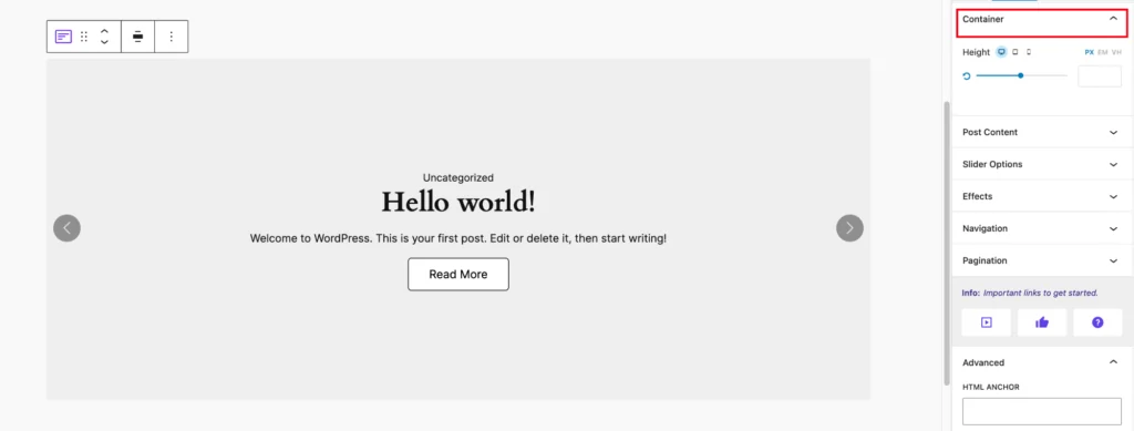
Container
A container block in Gutenberg facilitates the grouping of several blocks together, enabling users to arrange content sections and apply common styles, like alignment, padding, and background color.
- Height: Adjusts the block’s vertical size, measured in PX, EM, or VH.
- Padding: Adds space inside the block around the content, set individually for each side.
- Margin: Controls the space outside the block, separating it from other elements, set for each side.
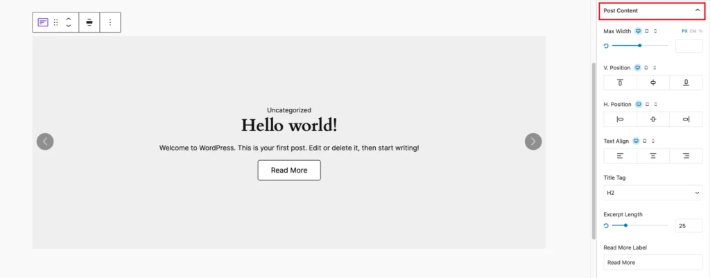
Post Content
The Post Content block in Gutenberg shows the primary content of a page or post inside of templates. It dynamically pulls and shows the specific text, images, and other elements from each post, helping create consistent layouts across multiple posts.
- Max Width: Sets the maximum width of the post content.
- V. Position: Adjusts vertical alignment of the content (top, middle, or bottom).
- Text Align: Controls text alignment (left, center, right).
- Title Tag: Defines the heading level for post titles (e.g., H2).
- Excerpt Length: Sets the number of words in the post excerpt.
- Read More Label: Customizes the “Read More” button text.
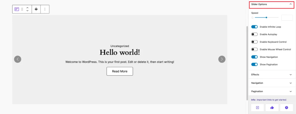
Slider Option
In Gutenberg, the Slider Option allows users to create interactive image or content sliders directly within their posts or pages. Slide transition, autoplay, navigation arrows, and pagination are among the customization options that make it simple to include interesting, scrollable sections that improve both user engagement and visual appeal.
- Infinite Loop: Slides cycle continuously.
- Autoplay: Slides play automatically.
- Keyboard Control: Navigate using keyboard keys for better accessibility.
- Mouse Wheel Control: Scroll through slides with the mouse wheel.
- Navigation: Choose to show or hide slider navigation.
- Pagination: Choose to show or hide pagination, with various types available.
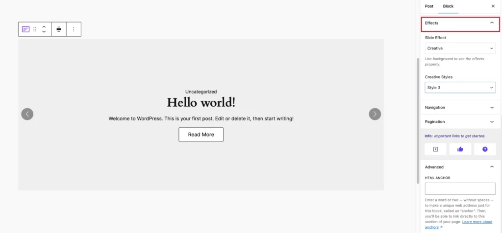
Slider Effects
Slider effects, which include zoom, flip, slide, and fade effects, add captivating animations and transitions to sliders. These settings enhance sliders’ visual vibrancy, drawing users in and enhancing the content’s overall interactivity.
- Flip: 3D flip transitions between slides.
- Fade: Smooth opacity changes for subtle effects.
- Slide: Moves slides horizontally or vertically.
- Coverflow: Overlaps and shifts slides for a cover flow animation.
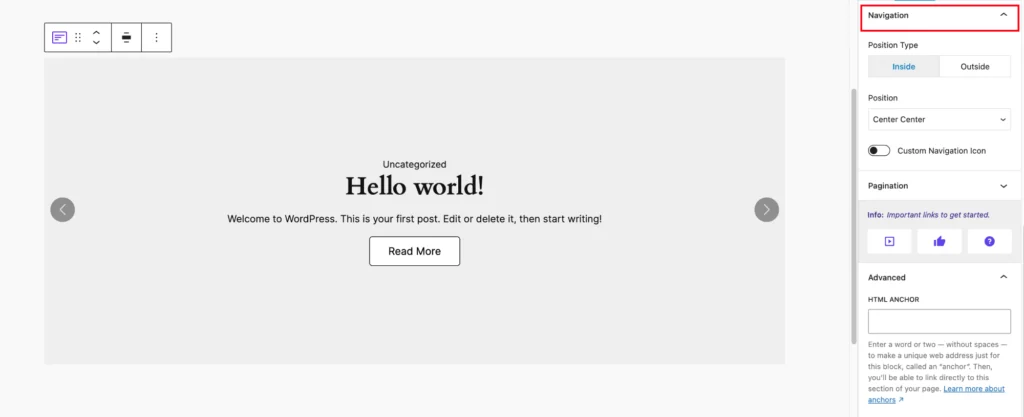
Navigation
- Position Type: Choose to place navigation icons inside or outside the slider.
- Position: Select specific icon placement: “Center Center,” “Top Left,” “Top Right,” “Bottom Left,” or “Bottom Right.”
- Custom Navigation Icon: Enable to upload a custom icon; disable to use default icons.
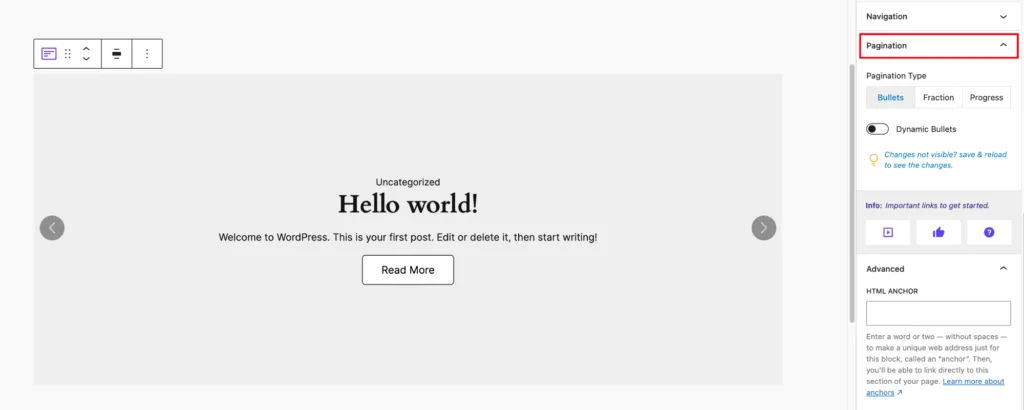
Pagination
- Bullets: Shows pagination dots at the slider’s bottom.
- Fraction: Displays a fraction at the bottom, indicating the current page and total pages.
- Dynamic Bullets: When enabled, pagination dots change color to show the active page. When disabled, dots stay the same color.
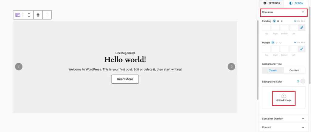
Container Style
Container style refers to design settings for a container block, including background, padding, margin, and overlays, allowing users to control its appearance and layout on the page.
- Padding and Margin: Controls spacing inside (padding) and outside (margin) the container.
- Background Type: Choose between Classic (solid color or image) and Gradient backgrounds.
- Classic: Solid color or image background.
- Gradient: Smooth transition between multiple colors.
- Background Color: Set a solid background color for the container.
- Upload Image: Add a background image to enhance visual appeal.
- Container Overlay: Apply overlay effects for added design flexibility.
Container Overlay Style
the Container Overlay settings in Gutenberg, where users can enable an overlay effect on a container block.
- Enable Overlay: A toggle switch to turn the overlay on or off.
- Overlay Type: Choose between Classic (solid color) and Gradient overlays.
- Overlay Color: Set the color of the overlay.
- Overlay Opacity: Adjust the transparency of the overlay, allowing for a blend effect with the background.

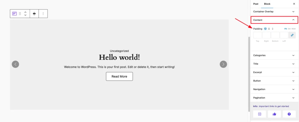
Slide Content
- Top padding: Space between the content and the top border.
- Right padding: Space between the content and the right border.
- Bottom padding: Space between the content and the bottom border.
- Left padding: Space between the content and the left border.
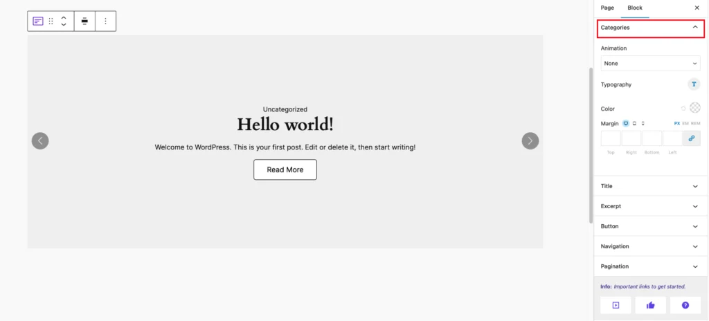
Categories
n GutSlider, a “category” refers to different types or styles of sliders and carousels, such as Blog Post sliders, product carousels, or image sliders.
- Animation: Choose and customize animation effects for elements.
- None: No animation applied.
- Fade Up: Element fades in while moving upward.
- Fade Down: Element fades in while moving downward.
- Fade Left: Element fades in while moving leftward.
- Fade Right: Element fades in while moving rightward.
- Slide Up: Element slides in from the bottom.
- Slide Down: Element slides in from the top.
- Slide Left: Element slides in from the right.
- Slide Right: Element slides in from the left.
- Color: Select and adjust color schemes for various elements.
- Typography: Modify font styles, sizes, and other text properties.
- Margin: Set and customize margins for different devices, with unit options like PX, EM, and REM.
Navigation Style
Navigation style customizes icon placement, size, border, and colors for smooth, user-friendly interaction.
- Width: Set the width of navigation icons.
- Height: Adjust the height of navigation icons.
- Icon Size: Customize the size of the navigation icons.
- Border Style: Choose the border style for icons.
- Border Radius: Define the curvature of icon borders.
- Margin: Set the spacing around navigation icons.
- Normal and Hover States: Select colors and backgrounds for both normal and hover states.
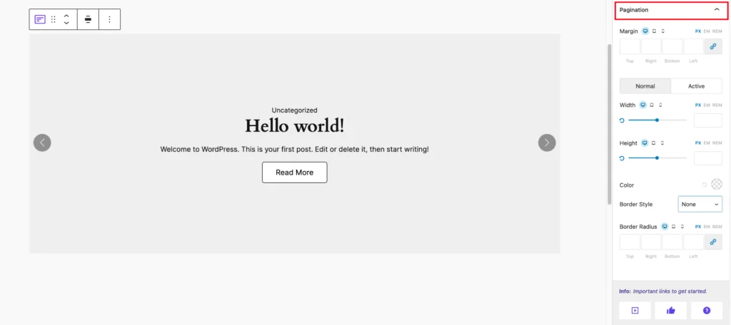
Pagination Style
Pagination style customizes the look and function of pagination controls, like dots and arrows, for smooth navigation.
- Margin: Adjust the spacing around the pagination elements.
- Width: Set the width of the pagination indicators.
- Height: Customize the height of the pagination indicators.
- Color: Select the color for pagination elements.
- Border Style: Choose the border style for pagination elements.
- Border Radius: Define the curvature of the pagination borders.
Customization
Gutslider is highly customizable, it allows you to customize everything you need. You can add more containers, background color, container overly, title , animation, typography, excerpt, Margins, button, navigation, pagination, height, width, padding, and border-radius.
- Container: Main item wrapper.
- Background Color: Set container color.
- Container Overlay: Add overlay effect.
- Title: Display item title.
- Animation: Add visual transition effects.
- Typography: Customize text style.
- Excerpt: Show a brief item summary.
- Margin: Adjust outer spacing.
- Button: Add action buttons.
- Navigation: Enable directional controls.
- Pagination: Show slide/page indicators.
- Height: Set container height.
- Width: Set container width.
- Padding: Adjust inner spacing.
- Border Radius: Round container edges.
Conclusion
The Blog Post Block in Gutenberg is an essential tool for WordPress users aiming to create compelling, visually appealing blog posts. Integrated seamlessly into the Gutenberg editor, it provides an intuitive, code-free interface that makes blog writing and layout design a breeze. With extensive customization options, users can effortlessly add images, videos, and various content blocks to craft unique and engaging posts.