
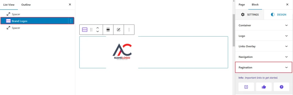
To Style your expected Pagination, navigate to the Design tab and open the Pagination Panel. You can see the Pagination. Now, simply click on your expected Pagination style.
The Pagination Style within the slider block enables users to personalize the appearance of the pagination. so you can use any choice of your customization:
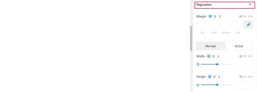
- Margin: Controls the spacing between the block and surrounding elements, with separate settings for top, right, bottom, and left.
- Width: Adjusts the width of the block.
- Height: Adjusts the height of the block.
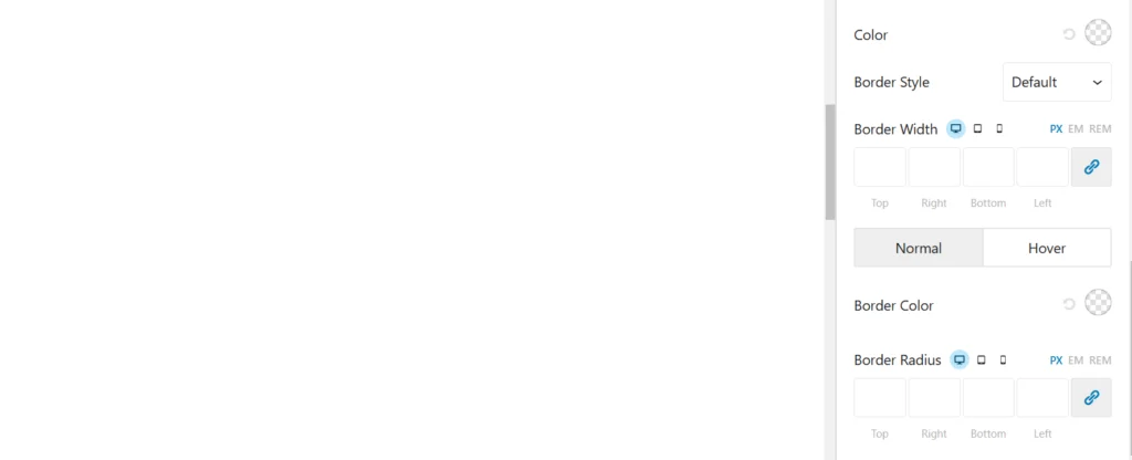
- Color: Sets the color of text or other elements within the block.
- Border Style: Defines the style of the block’s border.
- Border Width: Adjusts the border’s thickness.
- Border Color: Sets the color of the border.
- Normal Style: The default appearance of the element when it is not being interacted with. For example, a button’s color, font, or border in its idle state.
- Hover Style: The appearance of the element when a user hovers their cursor over it. This is typically used to create interactive effects, such as changing the button’s background color, text color, or adding an animation.
- Background: Specifies the background color of the block.
- Border Radius: Creates rounded corners for the border.