
Select the parent Before After slider and navigate to the Settings tab. Now open the General panel. Now you can see the General settings and click its appears customization.
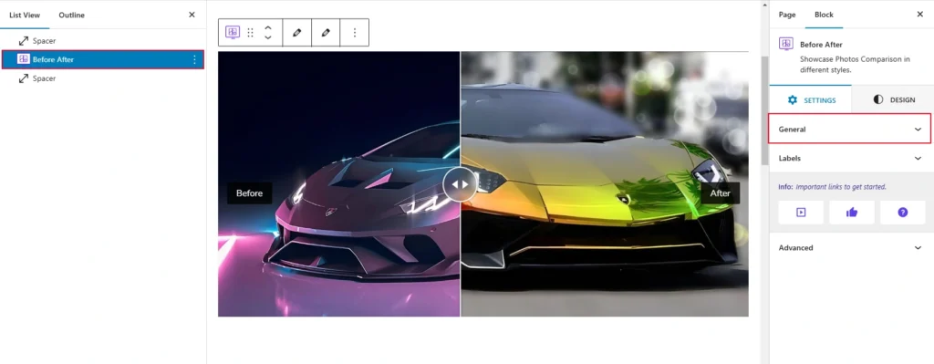
When you click on the “General” option, you will see several settings that can be adjusted using sliders and various controls. Here is what is shown below in the screenshot for reference:
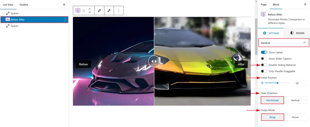
- Show Labels: A toggle switch that, when enabled, displays labels on the slider. Labels could indicate “Before” and “After” for clarity.
- Show Slider Caption: This toggle controls whether captions are displayed along with the slider. When turned on, text captions related to the images will be visible.
- Disable Sliding Behavior: This option disables the sliding functionality. When enabled, users may not be able to interact with the slider to move between images.
- Only Handle Draggable: When enabled, this restricts the sliding to only occur when dragging the handle. Users cannot swipe or click elsewhere to interact with the slider.
- Initial Position: A slider control (with a percentage value) allows you to set the default position of the slider handle. The number (in this case, 50) indicates the initial placement of the handle, likely in the middle by default.
Slide Direction
The Before-After block includes two types of slide directions, and they are:
- Horizontal: It is the default slide direction. It allows users to move the slide from left or right or right to left horizontally.
- Vertical: The vertical slide direction allows you to slide it from top to bottom or bottom to top vertically.
Swipe Mode
Both drag and hover swipe modes are available for the Before After block. Both drag and hover swiping modes are available to you. Drag mode, which lets you slide the handle while dragging, is the default mode.