
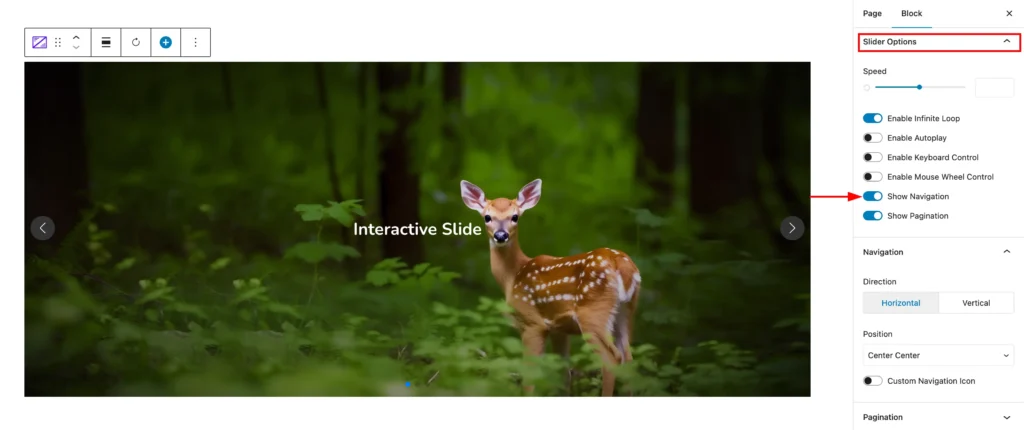
To style the slider navigation, make sure you have enabled it from the setting tab. To enable the navigation, select the main Shader Slider and navigate to Settings tab. Now open the Slider Options panel and turn on the Show Navigation style.
If you have successfully enabled the Navigation, now navigate to the Design tab and open the Navigation panel. The panel includes the following settings:
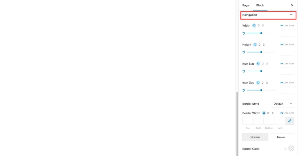
- Width: This option allows you to adjust the width of the block.
- Height: This option allows you to adjust the height of the block.
- Icon Size: This option allows you to adjust the size of any icons within the block.
- Icon Gap: This option allows you to adjust the spacing between icons.
- Border Style: This option allows you to choose the style of the border around the block.
- Border Width: This option allows you to adjust the thickness of the border.
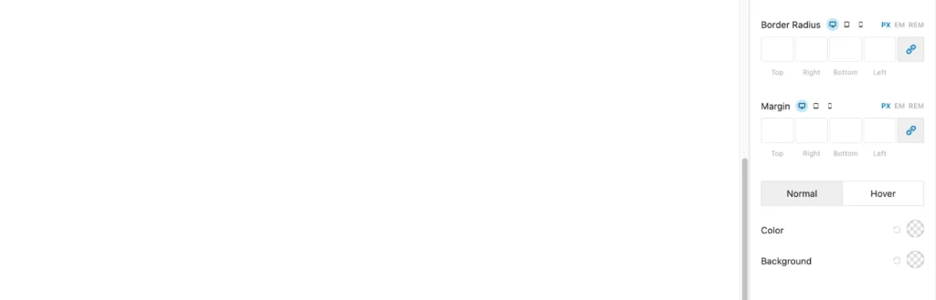
- Border Color: This option allows you to choose the color of the border.
- Border Radius: This option allows you to create rounded corners for the border.
- Margin: This controls the spacing between the element and the elements around it. You can set different margins for each side (top, right, bottom, and left).
- Normal and Hover: These options allow you to set different styles for the element when it’s in its normal state and when the user hovers over it.
- Color: This allows you to set the color of the text or other elements within the element.
- Background: This allows you to set the background color of the element.