
To style Content, navigate to the Design tab and open the Content Panel. You can see the Content . Now, simply click on your expected Content.
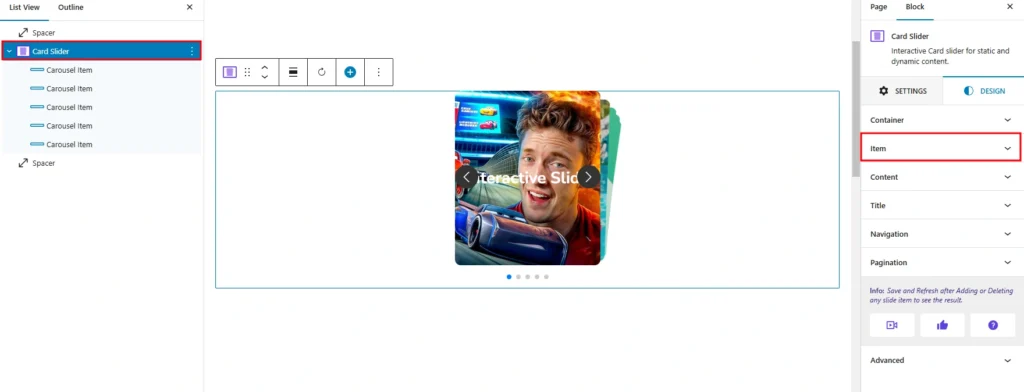
The Item settings allow you to customize the appearance and layout of individual items within the Card Slider.
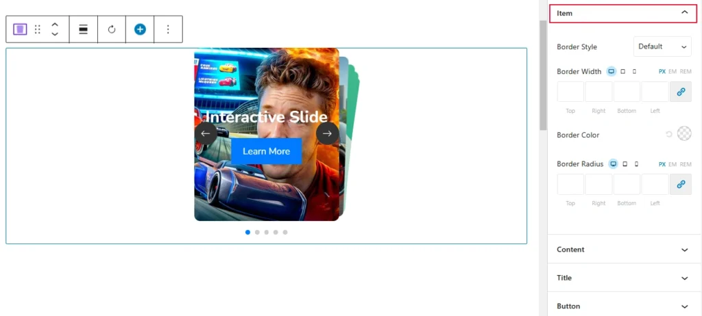
- Border Style: Allows you to set a border type (e.g., solid, dashed, dotted) for the item.
- Border Width: Defines the thickness of the border for each side (Top, Right, Bottom, Left).
- Border Color: Specifies the color of the border.
- Border Radius: Rounds the corners of the item by defining the radius for each corner.