
To style Marquee Slider, navigate to the Design tab and open the Button Panel. You can see the Button . Now, simply click on your expected Content.
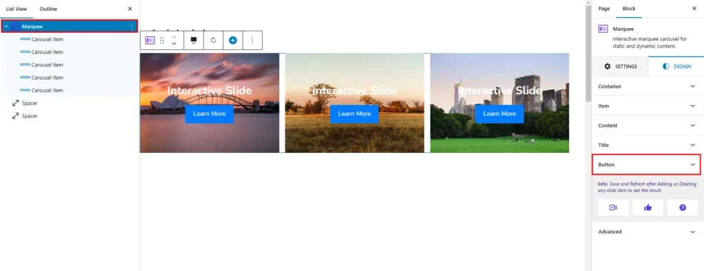
The Button Style allow you to customize the appearance and layout of individual Buttons within the Marquee Slider.
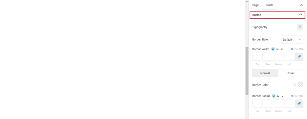
- Typography: This option provides settings to customize the font, size, and style of the text.
- Border Style: Allows you to set a border type (e.g., solid, dashed, dotted) for the item.
- Border Color: Specifies the color of the border.
- Border Width: Defines the thickness of the border for each side (Top, Right, Bottom, Left).
- Border Radius: Rounds the corners of the item by defining the radius for each corner.
- Font Size: You can adjust the size of the text using pixels (PX), Ems (EM), or rems (REM). You can also use the slider to visually adjust the size.
- Font Family: This lets you choose from different font families, such as Arial, Times New Roman, or custom fonts.
- Font Weight: You can set the thickness of the font, from thin to bold.
- Font Style: You can choose between normal and italic styles.
- Text Decoration: You can add underlining, overlining, or strikethrough to the text.
- Text Transform: You can convert text to uppercase, lowercase, or title case.
- Line Height: You can adjust the spacing between lines of text.
- Letter Spacing: You can adjust the spacing between individual letters.
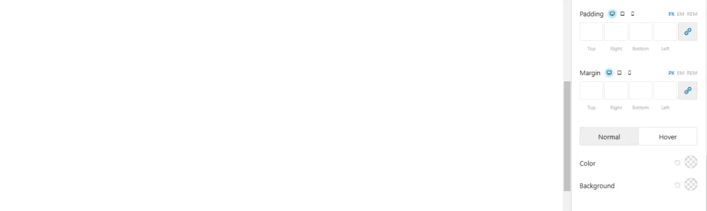
- Margin: This option controls the spacing around the block.
- Color: This option likely controls the color of the text or other elements within the block.