
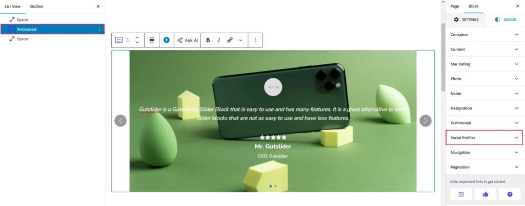
To Style your expected Social Profiles, navigate to the Design tab and open the Social Profiles Panel. You can see the Social Profiles. Now, simply click on your expected Social Profiles style.
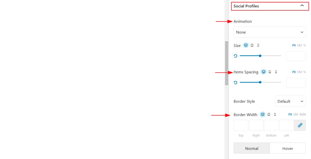
The Social Profiles style in the slider block allows users to customize the Social Profiles appearance. Available options include. There are eight animation available now.
- Fade Up: The element gradually appears as it moves upward with a fading effect, creating a smooth entrance.
- Fade Down: The element gently appears while moving downward with a soft fade-in effect.
- Fade Left: The element fades in while sliding from the left, giving a subtle and clean appearance.
- Fade Right: The element fades in smoothly as it moves from the right side into view.
- Slide Up: The element enters the screen by sliding upward from below, making a dynamic appearance.
- Slide Down: The element moves downward into view, sliding smoothly from above.
- Slide Left: The element slides into the frame from the left side, adding a sleek horizontal motion effect.
- Slide Right: The element enters by sliding horizontally from the right, creating a polished transition.
- Size: This option controls the size of the social profile icons. You can adjust the size using pixels (px), ems, or percentages (%).
- Items Spacing: This setting determines the spacing between individual social profile icons. You can adjust the spacing using pixels (px), ems, or percentages (%).
- Border Style: This option allows you to choose the style of the border for the social profile icons. You can select from various styles like solid, dashed, dotted, etc.
- Border Width: This setting controls the thickness of the border for the social profile icons. You can adjust the width using pixels (px), ems, or rems.
- Top, Right, Bottom, Left: These options allow you to set the border width for each side of the social profile icons individually.
- Normal, Hover: These options allow you to customize the appearance of the social profile icons in their normal state and when they are hovered over.
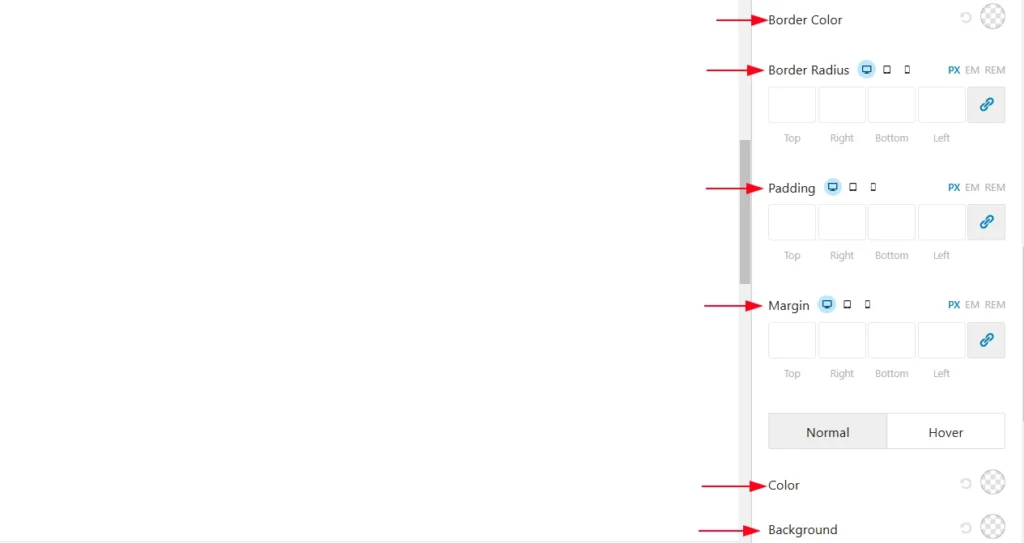
- Border Color: Allows setting or changing the border color of the element.
- Border Radius: Provides fields to adjust the border radius for the top, right, bottom, and left sides, controlling the roundedness of the element’s corners.
- Padding: Enables defining the inner spacing (padding) between the content and the border for all sides (top, right, bottom, left).
- Margin: Allows setting the outer spacing (margin) around the element for all sides.
- Normal / Hover: Provides two modes—Normal for regular appearance and Hover for styling when hovered over.
- Color: An option to change the color of the element.
- Background: Allows setting or changing the background color of the element.