
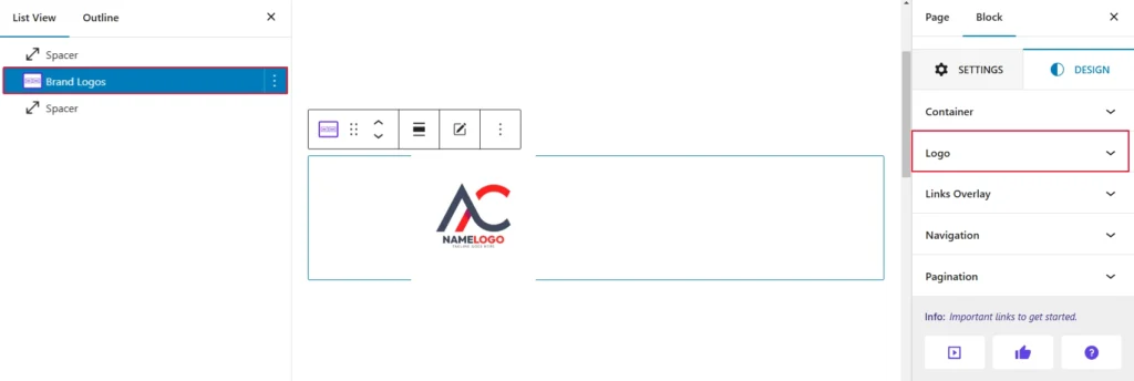
To Style your expected Logo, navigate to the Design tab and open the Brand Logos Panel. You can see the Logo. Now, simply click on your expected Logo style.
The Logo style in the slider block allows users to customize the Hover Effects appearance. Here Eight Hovers Effects Available include.
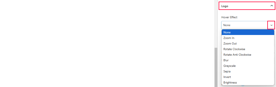
- Zoom In/Out: The object enlarges or shrinks when hovered over.
- Rotation: The object spins clockwise or counter-clockwise.
- Blur: The object becomes slightly blurred.
- Grayscale, Sepia, Invert: The object’s color is altered to a grayscale, sepia tone, or inverted colors.
- Brightness: The object’s brightness is adjusted.
- Cover: Image resizes to cover the entire area, preserving aspect ratio. Cropping might occur.
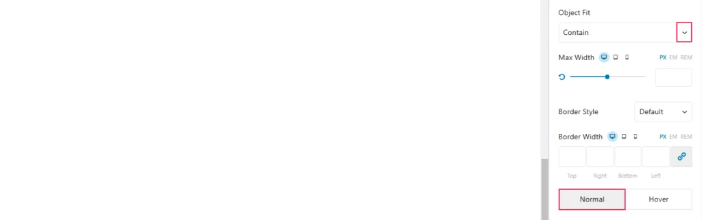
- Contain: Image fits within the area, preserving aspect ratio. No cropping, but empty space might appear.
- Fill: Image stretches to fill the area, not preserving aspect ratio. Can distort the image.
- Scale Down: Image resizes only if larger than the area, otherwise retains its original size.
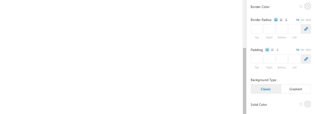
- Border Style: This option allows you to choose the style of the border around the block.
- Border Width: This option allows you to adjust the thickness of the border.
- Border Color: This option allows you to choose the color of the border.
- Border Radius: This option allows you to create rounded corners for the border.
- Background: This allows you to set the background color of the element.
- Margin: This controls the spacing between the element and the elements around it. You can set different margins for each side (top, right, bottom, and left).
- Normal and Hover: These options allow you to set different styles for the element when it’s in its normal state and when the user hovers over it.
- Color: This allows you to set the color of the text or other elements within the element.