
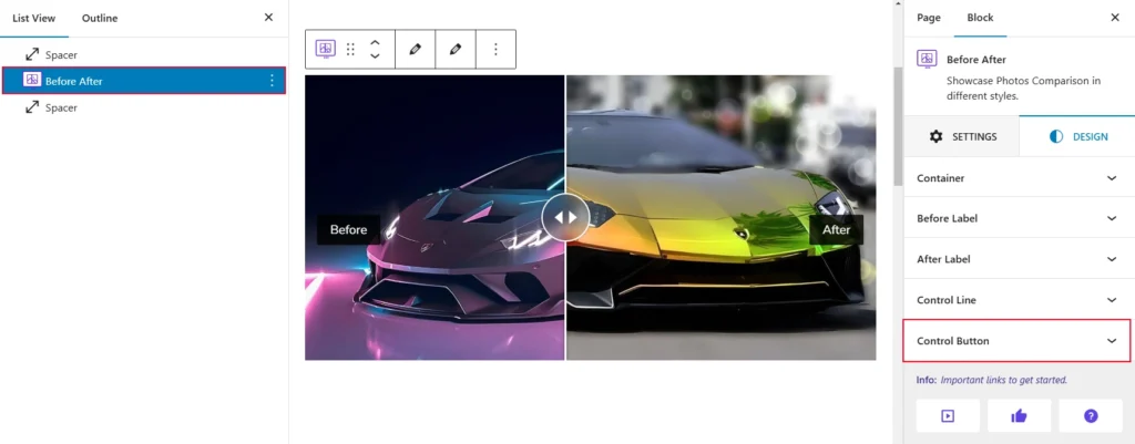
Select the parent Before After and navigate to the Design tab. Now open the Control Button panel. Now you can see the Control Button settings and click its appears customization.
When you click on the “Control Button” option, you will see several settings that can be adjusted using sliders and various controls. Here is what is shown below in the screenshot for reference:
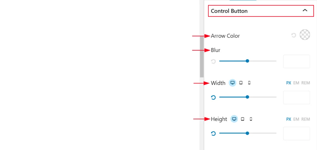
- Arrow Color: This option allows you to select the color for any arrows or icons associated with the button.
- Blur: This setting controls the blur or shadow effect applied to the button.
- Width: This option lets you adjust the width of the button, with options for specifying the width in pixels (PX), ems (EM), or REM.
- Height: This option allows you to adjust the height of the button, with options for specifying the height in pixels (PX), ems (EM), or REM.
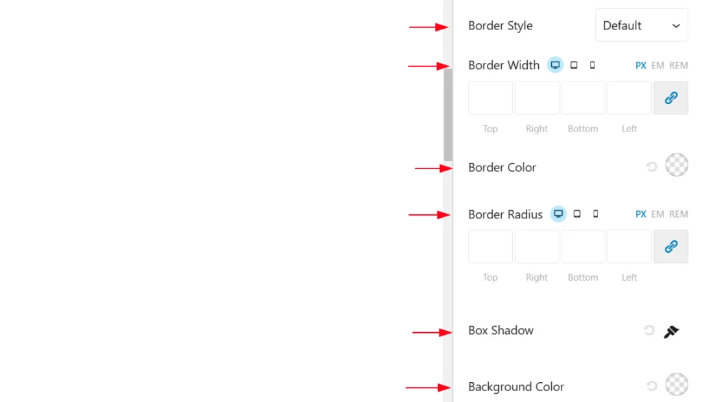
- Border Style: This option lets you choose the type of border for the button, such as solid, dashed, dotted, or none.
- Border Radius: This setting controls the rounded corners of the button, with options for specifying different radii for top, right, bottom, and left corners.
- Box Shadow: This setting allows you to add a shadow effect to the button, with options for color, opacity, blur radius, spread radius, and horizontal and vertical offset.
- Background Color: This option lets you select the background color for the button.